Tuesday, April 16
A Curated Gallery of Smashing Fonts for Creative Designers
38,691 Premium Fonts
Tuesday, April 16
A Curated Gallery of Smashing Fonts for Creative Designers
38,691 Premium Fonts


 Designer: Rian Hughes
There are two additions to the core 28-weight family: a three-weight stencil set, and a four weight text family. The text weights have been adjusted for use at small point sizes, and feature more open character shapes, looser inter-letter spacing for improved readability, and lining numerals for use in listings and tables.
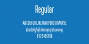
Several core ideas inform Paralucent's design. Prime attention has given to the negative space between characters, giving a more even "colour", especially in text. For example, the J, L and T have shorter arms than comparable sans typefaces, while the M and W are wider. The A has a lower bar, opening up the interior counter. An unusually high lower-case x-height again helps to give a more even colour and improve legibility. Care has been taken to rationalise repeated elements like the tails on lower-case letters, or the Q and the "ear" of the g. Typographic design solutions that are consistent across all these features add more stylistic cohesion.
'Ink traps' are exaggerated incisions used to open up a letter's narrower internal angles, which can become clogged with ink, especially in small point sizes. Now largely redundant due to the high quality of modern print, they are still sometimes used as a stylistic quirk or design feature. Now that digital fonts are often reversed or outlined, or enlarged to enormous sizes, these can also lead to unexpected or obtrusive results. Paralucent takes these inevitable digital manipulations into account, and adds optical corrections without resort to ink traps.
The family has been picked up by many UK and US publishers, featuring heavily in magazines like Loaded, Heat and TV Quick, as well as high-end coffee-table photography books and gallery websites.
A perennial Device bestseller.
Font Family:
· Paralucent Condensed Extra Light Italic
· Paralucent Condensed Demi Bold Italic
· Paralucent Stencil ExtraLight
· Paralucent Stencil Medium
· Paralucent Stencil Heavy
Tags: advertising, all purpose, alternates, authoritative, basic, bold, book, brand, branding, broker, business, businesslike, city, classy, clean, clear, commercial, company, compressed, condensed, contemporary, corporate, display, display sans, editorial, elegant, family, fashion, functional, geometric, got it, grotesk, grotesque, hairline, headline, heavy, helvetica, helvetica alternative, high-end, high tech, humanist, industrial, industry, legible, light, logical, logo, machine, magazine, masculine, minimal, modern, monoline, narrow, neutral, no-nonsense, packaging, plain, poster, precise, premier, premium, professional, rational, readable, refined, reliable, road sign, rounded, sans, sans-serif, sans serif, sign, signage, sophisticated, square, stencil, sterile, straightforward, stylish, superfamily, swiss, tech, technical, techno, technology, text, thin, univers, versatile, workhorse