Wednesday, April 24
A Curated Gallery of Smashing Fonts for Creative Designers
38,691 Premium Fonts
Wednesday, April 24
A Curated Gallery of Smashing Fonts for Creative Designers
38,691 Premium Fonts


 Designers: Krista Likar, Alja Herlah
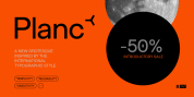
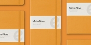
Typeface Plecnik is defined by classical elements and shapes. With classic proportion, humanist stroke endings and low contast, Plecnik comunicates a modern, elegant and sophisticated message. Due to Plecnik's recognisable shapes the typeface remaines memorable and irreplaceable. When used for book and editorial designs, branding, packaging or display, Plecnik will perform in its purpose. Designed in four weights and accompanied with italics, Plecnik also offers a Display style, which is even more distinctive and perhaps even more attributable to Plečnik.
Font Family:
· Plecnik Light
· Plecnik Light Italic
· Plecnik Regular
· Plecnik Regular Italic
· Plecnik Medium
· Plecnik Medium Italic
· Plecnik Bold
· Plecnik Bold Italic
· Plecnik Trial Light
· Plecnik Trial Display
Tags: architecture, book design, booktext, brand identity, branding business, brochure, classic, classic proportions, display, elegant, exhibition, geometric, geometric-sans, ligatures, modern, modern sans serif, packaging, poster, small caps, sophisticated