Tuesday, April 23
A Curated Gallery of Smashing Fonts for Creative Designers
38,691 Premium Fonts


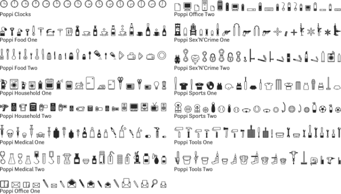
 Designed by Martin Friedl, Poppi is a dingbat font family. This typeface has fifteen styles and was published by Emigre.
About Poppi
The first Poppi pictograms emerged from my final year project at the Stuttgart Academy of Arts. The self-imposed task was to design a comprehensive visual identity for a community center including logo, posters, leaflets and brochures, but also a signage system for inside the building. Specifically designed symbols formed an important part of the project because of my general enthusiasm for pictograms, but also in view of non-German-speaking visitors.
Before I started this project I had visited Egypt. It was in several respects an impressive trip. Early Egypt culture shows one of the most interesting and sophisticated symbolic languages, and it was an unforgettable experience to see those thousands of years old ideograms in their original setting. On the other hand, European visitors to present-day Egypt are not only confronted with a foreign language but also with letters that don’t “talk to them.” Even though signposts written in the English language and in Latin letters may be available in the centers of large cities or in important museums, you are on your own when traveling the back roads or when visiting a local Arabian market. When dealing with a language that uses Latin letters you can correctly copy the street name of your destination (even if you don’t understand what it says) and hand it to the taxi driver. When we tried to do the same in Egypt, our sketched Arabic letters may have implied some insult because the result was a heap of abuses (not understood, but presumably deserved) as the driver left us standing in the dust.
Today, everyone has the possibility of crossing linguistic borders, either with affordable flight tickets or through present-day communication technology. This gave me the idea to develop a comprehensive image-based language encompassing all areas of everyday life, allowing for communication beyond linguistic barriers. (Okay, it’s an ambitious project, but even the old Egyptians had to start with a few pictograms. Plus, that final year project at the Stuttgart Academy of Arts was never completed.)
How they were made
In the beginning, whenever I saw an object that I thought would make an interesting icon, I produced a little pencil sketch on paper, scanned it, and re-constructed it in Freehand. I then exported the file into Fontographer and worked to perfect the details. But after hundreds of icons, and countless hours of work, the process changed, and most importantly, I finally learned how to manage the duality of my home and workplace.
Friends and loved ones tend to believe that as long as no cursor is blinking on the computer screen in my living room, my mind is with them and not with my work. I am happy to leave them to their belief. Little do they know that I now perceive my surroundings as a system of symbols. No detour of sketching, scanning, and reconstruction is needed anymore. An icon may be produced in the living room with my computer turned off. I may have a relaxed weekend with my loved ones and, on Monday, the only task left is to digitize the final version I designed in my mind. Creating these icons has become second nature to me.
The decision of which icons to include was initially a pragmatic one. To start with, there were the existing icons from my unfinished final year project. Then, it seemed sensible to match common informational pictogram sets with necessities, such as letter, phone or fax. However, I wanted to go beyond the obvious, to other areas of everyday life. I wanted to explore the potential of an image-based language and ask: “might it be possible to buy a Metro ticked in Cairo without requiring assistance, or to write instructions for the use of a cellular phone, without a single written word?” Poppi is the first step towards providing the answer.
—Martin Friedl
Font Family:
