Thursday, April 18
A Curated Gallery of Smashing Fonts for Creative Designers
38,691 Premium Fonts


 Portada was designed by Veronika Burian, José Scaglione and published by TypeTogether. Portada contains 21 styles and family package options.
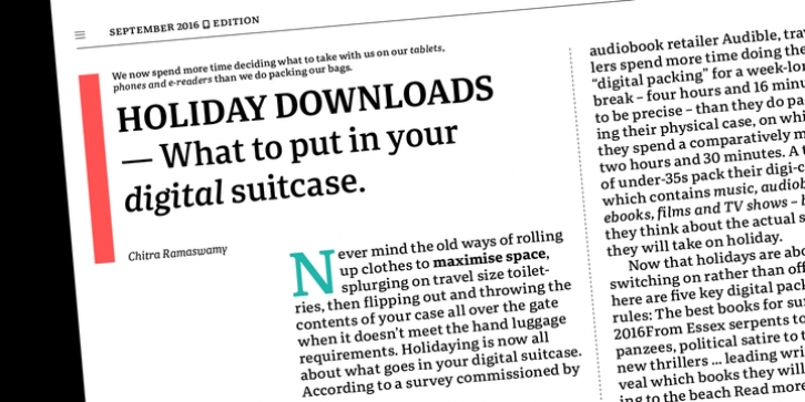
 Portada was created from and for the digital world - from e-ink or harsh grids to Retina capability - making it one of the few serifs of its kind. Portada's text and titling styles were engineered for superlative performance, making great use of sturdy serifs, wide proportions, ample x-height, clear interior negative space, and its subservient personality. After all, words always take priority in text.
It's not all business, though. Portada's italics contain an artefact of calligraphy in which the directionality of the instrokes and the returning curves of the outstrokes give the family a little unexpected brio. Yet even the terminals are stopped short of flourished self-absorption to retain their digital clarity. When printed these details are downright comforting. Portada's titling styles enact slight changes while reducing the individual width of each character and keeping the internal space clear. Titling italics have increased expressiveness across a few characters rather than maxing out the personality in each individual glyph.
Digital magazines, newspapers, your favourite novel, and all forms of continuous screen reading benefit from Portada's features. This family can also cover many of the needs developers have: user interface, showing data intensive apps on screen, even one-word directives and dialogs. And, as a free download, an exhaustive set of dark and light icons is included to maintain Portada's consistent presence, whether as a word or an image. The complete Portada family (eight text styles, ten titling styles, and one icon set) is designed for extensive, clear screen use - a rare serif on equal footing with a sans.
Font Family:
· Portada Thin
· Portada Thin Italic
· Portada Light
· Portada Light Italic
· Portada Regular
· Portada Italic
· Portada SemiBold
· Portada SemiBold Italic
· Portada Bold
· Portada Bold Italic
· Portada Extra Bold
· Portada Extra Bold Italic
· Portada Text
· Portada Text Italic
· Portada Text Book
· Portada Text Book Italic
· Portada Text SemiBold
· Portada Text SemiBold Italic
· Portada Text Bold
· Portada Text Bold Italic
· Portada Icons
Tags: contemporary, corporate, delicate, digital, economic, editorial, elegant, friendly, headline, hinted, humanist, latin, legible, logo, magazine, multilingual, news, newspaper, personal, pocketbooks, powerful, scotch roman, smooth, strong, text, titles, ui, user interface, warm, web
