Tuesday, April 16
A Curated Gallery of Smashing Fonts for Creative Designers
38,691 Premium Fonts


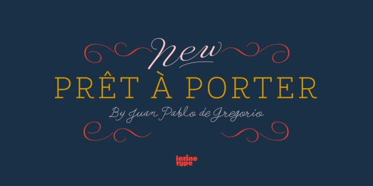
 Designed by Juan Pablo De Gregorio, Prêt-à-porter is a multiple classification font family. This typeface has twenty-nine styles and was published by Latinotype.
Prêt-à-porter is a project developed as part of a series of type experiments appearing on the blog ‘Letritas’. Prêt-à-porter is a very expressive friendly font with a handwritten look, smooth curves and strong identity. Its counterforms make it a carefree, wild, cheerful, light and highly readable typeface.
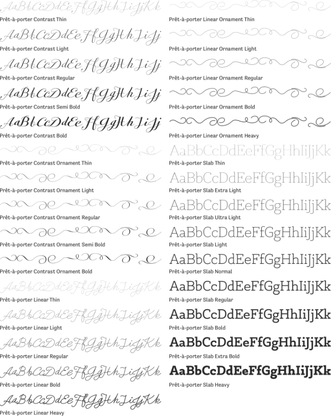
This type system consists of two Script families-Contrast and Linear-and a Slab family. The Contrast set works as a complement, providing more elegance and formal refinement. Both Linear and Contrast come in 5 weights plus Ornaments, which can be used as initial and terminal forms since they have been designed for connecting with each letter.
Linear and Contrast families include ligatures and the whole font family supports 208 different languages.
Font Family:
