Saturday, April 20
A Curated Gallery of Smashing Fonts for Creative Designers
38,691 Premium Fonts


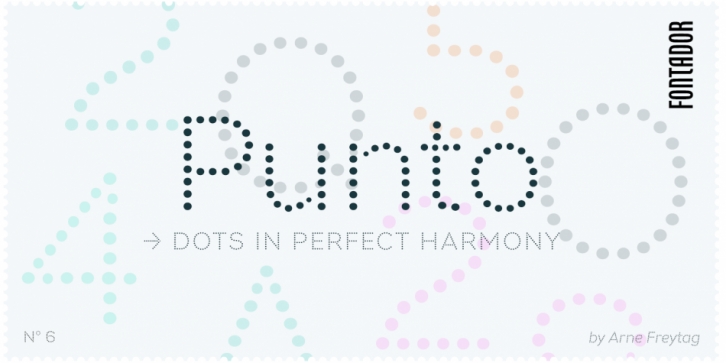
 Designed by Arne Freytag, Punto is a display sans and pixel font family. This typeface has six styles and was published by Fontador.
Punto is not made up of grid-based dots. They are optical corrected and there is always the same distance between the dots, with the aim to create more harmonic letterforms.
The dots also vary gradually in size to reflect the thickening and thinning of strokes, giving the letterforms a sophisticated overall look.
Punto comes up with 3 weights and 3 italics and is perfectly suited for logos, brands, magazines and special for signage systems and mobile devices.
The language support includes Western, Central and Eastern European character sets, as well as Baltic and Turkish languages.
The little sister of Punto is Punto Poly: A layered type system for cromatic typesetting.
Font Family:
