«Back ·
Pyke Font Download


 Designer:
 Sofie Beier
Publisher: Sofie Beier
The typeface
Pyke, named after the legibility researcher Richard Lionel
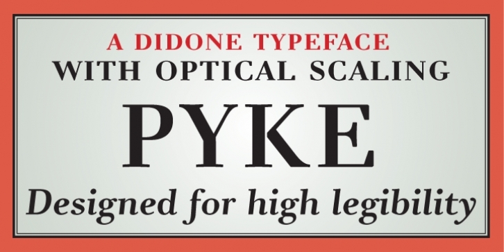
Pyke, is a serif typeface inspired by the work of Giambattista Bodoni.
An early version of the typeface was subjected to experimental legibility investigations of distance and time threshold methods*. Participants were exposed to different variations of the most frequently misread lowercase letters. The findings, which were implemented in the final designs, demonstrated that in a short exposure the italic style ‘l’ with a tail has a higher visibility than the ‘l’ with serifs at the bottom, that the Italic style descending ‘f’ is more visible at distance than the Roman style ‘f’, that a closed aperture of the ‘e’ lowers visibility in a short exposure, and that the same goes for the closed aperture of the ‘c’ at distance.
The typeface family
Pyke is size specific, including versions for Micro, Text, and Display.
PykeMicro is developed for small point sizes of 8 or less,
PykeText is for running text at regular text sizes of 9-14 points, and
PykeDisplay is designed for the larger print sizes.
PykeText and Micro are both inspired by Giambattista Bodoni’s earlier work having elements of the Transitional typeface tradition.
To improve readability and minimize the vertical feeling, the ascending lowercase stems of
PykeText and Micro are bent slightly forward, the Didone style high contrast and radical transition between horizontal and vertical counters have been toned down, and the lowercase letters ‘e’ and ‘c’ have a diagonal axis.
Historical traditions dictate the Didone style narrow characters to be extra narrow. Nonetheless, to enhance the horizontal flow this tradition was disregarded in the text versions of
Pyke; instead, emphasis was given to the forward movement by broadening and opening the loops in both characters ‘j’ and ‘f’. Another disregarded Didone style feature in
PykeText and Micro is the heavy teardrops on the letters ‘f’, ‘j’, ‘a’, ‘c’ and ‘r’, which seem to enhance the vertical movement in the letters.
Compared to the two text versions of
Pyke, the display version has a smaller x-height, larger contrast and narrower letters. Since headlines and titles often appear in large sizes at a close reading distance, readability may in these situations be less significant than in versions for running text. Furthermore, headings rarely consist of longer paragraphs, and are often perceived in few fixations. A horizontal emphasis is consequently not as vital, and so the Didone style tradition, such as: narrow letters ‘j’, ‘f’ and ‘t’, the heavy teardrops, and the high stroke contrast, can be applied. By emphasising these somewhat legibility troubling Didone features in the larger sizes alone, the typeface
PykeDisplay will in combination with
PykeText and
PykeMicro, add an element of elegance and sophistication to the layout without causing the reader strain.
* Beier, S. & Larson, K. (2010) ‘Design Improvements for Frequently Misrecognized Letters’, Information Design Journal, 18(2), 118-137
Font Family: Tags: agate, didone, legible, neo-didone, optical sizes, readability, scientific, serif, small sizes, text, transitional


 The typeface Pyke, named after the legibility researcher Richard Lionel Pyke, is a serif typeface inspired by the work of Giambattista Bodoni.
