Friday, April 26
A Curated Gallery of Smashing Fonts for Creative Designers
38,691 Premium Fonts


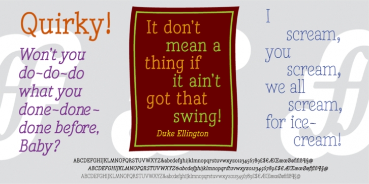
 Quirky was designed by Andy Benedek and published by Fine Fonts. Quirky contains 3 styles and family package options.
 For some time I had wanted to create a font from expanded stroked lines. I wanted to produce a light-hearted font, but with some classic touches. One day, whilst doodling in Adobe Illustrator, Quirky's letterforms just appeared on screen as if from nowhere. First I drew the test word 'hamburgefonts' and then just kept going, unable to stop. Character after character appeared as if by magic. From the start, Quirky had a life of its own.
The letterforms are rather more sophisticated than merely outlined stroked lines. Subtle adjustments to compensate for optical effects have been been incorporated. For example, horizontal stems have thicknesses slightly less than vertical stems and where stems join together, the thickening effect has been reduced by cutting into the joint.
Being almost monoline, Quirky works well reversed out of a solid background and for TV credits. The Quirky fonts are fun fonts, so set, laugh and enjoy! I hope Quirky will give you as much pleasure in using it as I got in creating it! Shortly after the roman version was born, an italic version and then a thin version were created to form a family of three fonts.
Font Family:
· Quirky Thin
· Quirky
· Quirky Italic
Tags: curvaceous, distinctive, fun, legible, monoline, serifed, swings, television, thin
