Thursday, April 25
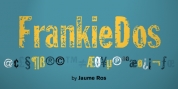
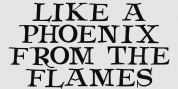
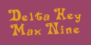
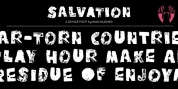
A Curated Gallery of Smashing Fonts for Creative Designers
38,691 Premium Fonts
Thursday, April 25
A Curated Gallery of Smashing Fonts for Creative Designers
38,691 Premium Fonts


 Designers: F. Kleukens, Patrick Griffin, Kevin King
This exclusive digitization expands on the original metal set by including small capitals and many alternates in all the styles. It also boasts a larger than usual linguistic support.
Font Family:
· Ratio Modern
· Ratio Modern Italic
· Ratio Modern Medium
· Ratio Modern Small Caps
· Ratio Modern ExtraBold
Tags: 1920s, advertising, ball terminals, chic, classic, contemporary, cosmetics, didone, elegant, european, exotic, fashion, fashionable, fat face, finance, formal, german, glamour, graceful, high-contrast, invitation, jewelry, magazine, modern, poster, refined, rmr-classic, rmr-serif-business, romantic, sensible, serif, shopping, small caps, stylish, upscale, valuable, vogue, wedding