Saturday, April 27
A Curated Gallery of Smashing Fonts for Creative Designers
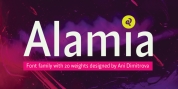
38,691 Premium Fonts
Saturday, April 27
A Curated Gallery of Smashing Fonts for Creative Designers
38,691 Premium Fonts


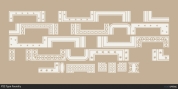
 Designer: Jeff Levine
The metal channels encasing the neon had an unusual 'feel' to some of the letters. While the original E,G and U of the sign looked 'interesting', they didn't quite fit the font's layout.
Those letters were scrapped for more traditional versions of them.
Font Family:
· Sign Sans JNL
· Sign Sans Oblique JNL
Tags: condensed, decal, decorative, display, headline, nostalgia, retro, roman, serif