Thursday, April 18
A Curated Gallery of Smashing Fonts for Creative Designers
38,691 Premium Fonts
Thursday, April 18
A Curated Gallery of Smashing Fonts for Creative Designers
38,691 Premium Fonts


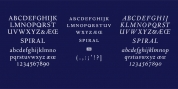
 Designer: James Todd
The typeface is designed to work both horizontally and vertically. Additionally, the fonts can work together in myriad chromatic expressions-providing limitless design possibilities.
The family is true to the spirit of masonry lettering without being a direct lift of any specific lettering style from the industrial age. Like some of its masonry predecessors Stack is built as a typeface of 15 courses (horizontal rows) of 'bricks.'
Based on several years of research a collection of 150+ photographs and roughly two dozen archival engineering drawings were amassed. The value of the historical references is a type family that is a legitimate reflection of masonry lettering styles of the period.
In updating Stack for the digital age, the proportions of the base-unit 'bricks' and the thickness of 'mortar' joints have been optically adjusted to work in both screen-based and print media.
Stack would not have been possible without the research and design input from Craig Welsh and Jenna Flickinger of GoWelsh.
Font Family:
· Stack Bricks
· Stack Courses
· Stack Fill
· Stack Mortar Bricks
· Stack Mortar Courses
Tags: chromatic, cyrillic, display, greek, industrial, small caps