Thursday, April 25
A Curated Gallery of Smashing Fonts for Creative Designers
38,691 Premium Fonts


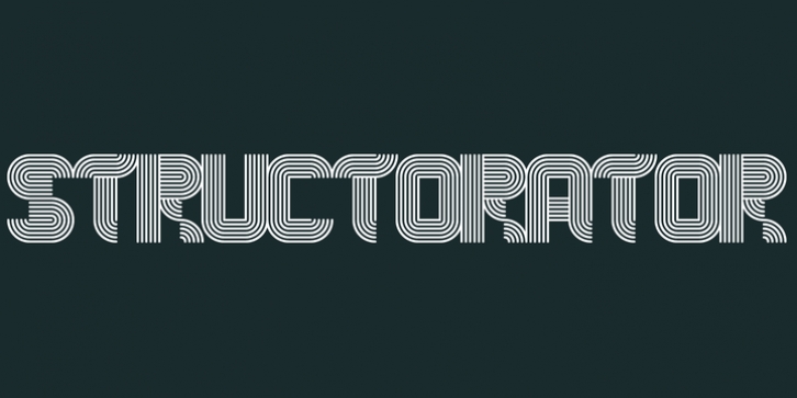
 Structorator was designed by Christian Gwiozda and published by Furiosum. Structorator contains 3 styles and family package options.
 This typeface emerged from experiments with generative type design. It evolved from a piece of code into a fully usable opentype font.
The two main features are its rigid but playful design and a multitude of alternate glyphs.
These features make it possible to create interesting lettering when using the default spacing.
The glyphs are constructed from a limited set of patterns which are arranged within a predefined grid.
The line thickness corresponds to the different cuts.
Due to the rather complex shape this font will look best in larger sizes and resolutions. Its best suited
for headline, display or illustrative work.
- 3 weights: light, medium and heavy
- 5 character sets
- 3 number sets
- Basic punctuation
- Seperate diacrits
- Ornamental glyphs
- Access via stylistic sets *OT feature
- Random access from the whole range of chars *OT feature
- Total of 1062 Glyps
Font Family:
· Structorator Light
· Structorator Medium
· Structorator Heavy
Tags: constructed, display, experimental, geometric, grid, modular, ornamental
