Thursday, April 18
A Curated Gallery of Smashing Fonts for Creative Designers
38,691 Premium Fonts


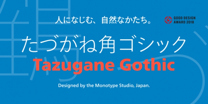
 Tazugane Gothic was designed by Monotype Studio and published by Monotype. Tazugane Gothic contains 10 styles and family package options. The font is currently #18 in Best Sellers.
 Tazugane Gothic was updated to support the "Reiwa" new era symbol. Reiwa can be written as two kanji: 令和. This update to Tazugane Gothic includes Reiwa designed as a single ligature and is encoded as U+32FF.
The inspiration for the Tazugane Gothic typeface is as elegant as its design. Since antiquity, cranes have been regarded in East Asia as auspicious birds for their noble appearance and elegance in flight. The typeface is named Tazugane Gothic in honor of the longevity of the crane, with the goal that it will be used for many years to come.
The combination of the Tazugane Gothic typefaces' traditional and humanistic elements, along with its intended ability to complement popular Latin typefaces, makes it one of the most uniquely flexible designs for applications where Japanese and Latin texts can be used together. The typeface family was created to have wide appeal, with a pleasing and consistent experience for readers, for use on screen, in print, in signage, packaging and advertising.
Tazugane Gothic has 10 weights. The Light, Book, Regular, Medium and Bold weights are considered best for text sizes. The Ultra Light, Thin, Heavy, Black and Extra Black weights are recommended for headline sizes.
Font Family:
· Tazugane Gothic Ultra Light
· Tazugane Gothic Thin
· Tazugane Gothic Light
· Tazugane Gothic Book
· Tazugane Gothic Regular
· Tazugane Gothic Medium
· Tazugane Gothic Bold
· Tazugane Gothic Heavy
· Tazugane Gothic Black
· Tazugane Gothic Extra Black
Tags: japanese, kanji, legibility, legible, organic, signage, advertising, ar/vr, automotive, balance, branding, consistency, corporate id, elegant, familiar, friendly, frutiger japanese, global, got it, harmony, hiragana, humanist, humanistic, japan, katakana, monotype, myfontsjpn, natural, neue frutiger, neue frutiger japanese, orig, readability, readable, rhythm, traditional, virtual reality, adaptable, augmented reality
