Friday, April 19
A Curated Gallery of Smashing Fonts for Creative Designers
38,691 Premium Fonts
Friday, April 19
A Curated Gallery of Smashing Fonts for Creative Designers
38,691 Premium Fonts


 Publisher: Quadrat Communications
Toronto Subway is based on the lettering originally used for station identification and signs by the Toronto Transit Commission (TTC) in the Toronto, Canada, subway system. The first subway line opened in 1954. Over the years and subsequent expansion of the subway, the signs became corrupted by the use of other typefaces such as Helvetica and Gill Sans. The lettering on the original signs consists only of uppercase characters and a few bits of punctuation in two weights — the Regular and Bold. Their style was followed as much as possible in designing the lowercase, punctuation and other special characters.
The Toronto Subway family was expanded in 2014 with the addition of the Light and Black weights.
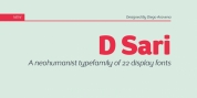
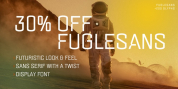
Font Family: