Friday, April 26
A Curated Gallery of Smashing Fonts for Creative Designers
38,691 Premium Fonts
Friday, April 26
A Curated Gallery of Smashing Fonts for Creative Designers
38,691 Premium Fonts


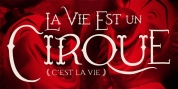
 Designer: Russell Bean
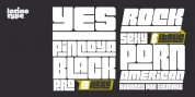
That was the year my five-weight design won the inaugural (and only) Lettergraphics International Alphabet design competition and shut out 5000 competitors. Alas, Lettergraphics ceased to trade from its LA studios after the mid-80s and Virginia's two-inch film fonts were left to collect dust on the cutting room floor.
Until my recent decision to revive her along with some subtle tweaking, a few additional glyphs and Opentype features, supported by an abundance of kern pairs making Virginia suitable for text or the largest display type.
Font Family:
· Virginia ExtraLight
· Virginia Light
· Virginia Medium
· Virginia Bold
Tags: 1970s, art deco, bauhaus, fashionable, geometric, legible, monoline, rococo, sans-serif