Friday, April 26
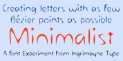
A Curated Gallery of Smashing Fonts for Creative Designers
38,691 Premium Fonts
Friday, April 26
A Curated Gallery of Smashing Fonts for Creative Designers
38,691 Premium Fonts


 Designers: Berthold Wolpe, Toshi Omagari
From the original, very heavy weight design, Omagari started by creating a black weight, followed by four lighter weights for Wolpe Fanfare, preserving the character of the letterforms all the way down to a thin version. "I wanted to do more than digitize the original weight," he says. "It's surprisingly modern, and its skeleton, its basic structure, is so beautiful."
The new design packs more into a small space than most typefaces. It's a natural for publication and advertising design. With displays capable of revealing fine details such as Fanfare's subtly slanted baseline, its lovely forms will easily translate to mobile devices. With an extended European character set that includes Greek and Cyrillic language support, Wolpe Fanfare can speak in many languages.
Font Family:
· Wolpe Fanfare Thin
· Wolpe Fanfare Light
· Wolpe Fanfare Regular
· Wolpe Fanfare Bold
· Wolpe Fanfare Black
· Wolpe Fanfare Inline Regular
Tags: 1930s, advertising design, berthold wolpe, cyrillic, fia2019, fia2019out, greek, modern, paneuropean, publication, stanley morison, toshi omagari, wolpe collection