Thursday, April 25
A Curated Gallery of Smashing Fonts for Creative Designers
38,691 Premium Fonts
Thursday, April 25
A Curated Gallery of Smashing Fonts for Creative Designers
38,691 Premium Fonts


 Publisher: Canada Type
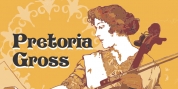
So between 1914 and 1916, de Roos and van Royen collaborated on the typeface eventually known as Zilvertype, and which both parties viewed as an improved version of Hollandse Mediaeveal.
Like Hollandse Mediaeval, Zilvertype was based on the Jenson model, but it is simpler, with more traditional metrics, lighter and more classic in color.
This Pro digital version of Zilvertype comes expanded in all directions. It contains a roman, a bold and an italic. Each font contains over 685 glyphs, including small caps, eight different sets of figures, plenty of ligatures, some Dutch ornaments, and extended language support covering most Latin languages. Zilvertype Initials is also there to round out this distinctively Dutch text family and make it ideal for immersive text design.
Font Family:
· Zilvertype Pro
· Zilvertype Pro Italic
· Zilvertype Pro Bold
· Zilvertype Initials
Tags: 1910s, 1920s, book, book text, classy, clean, conservative, custom, dutch, dynamic, elegant, fancy, flair, formal, garalde, headline, historic, initials, invitation, jenson, legible, letterpress, magazine, monogram, natural, news, news text, old-style numerals, oldstyle, personal text, sensible, serif, small caps, sturdy, text, venetian, vintage