Saturday, April 27
A Curated Gallery of Smashing Fonts for Creative Designers
38,691 Premium Fonts


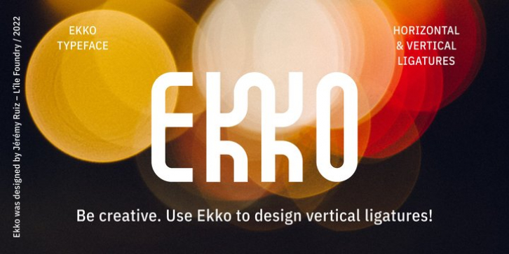
 Ekko was designed by Jérémy Ruiz and published by L'île Foundry. Ekko contains 1 style. The font is currently #39 in Hot New Fonts.
 Indeed, it contains 1287 alternate glyphs.
By combining these alternate glyphs between them, you can design real vertical ligatures.
The graphic possibilities are numerous and various.
Ekko gives you the opportunity to play, to experiment and to discover, in order to associate the various vertical ligatures between them, in a balanced and harmonious way.
Thus, Ekko makes it possible to express the musicality of each word, and to give a specific, original and unique rhythm to each composition.
Following the spirit of jazz music: nothing is predefined, but everything remains open.
Be creative and enjoy!
We recommend that you use Ekko with a line spacing suitable to the font size with a ratio between 0,54 and 0,6. For example, if the font size is 100 pts, the best line spacing will be between 54 and 60 pts.
In order to give the best flexibility to Ekko, you can also find, through other alternate glyphs, different widths for each letter (except: M, N, V and W in uppercase).
Each letter, lowercase and uppercase combined, is thus available in dimensions: 3x8, 5x8 and 7x8.
Ekko also contains 28 horizontal ligatures.
Font Family: Ekko Regular
Tags: advertising, alternate, app, branding, contemporary, decorative, design, different, digital, display, display font, display typeface, editorial, experimental, geometric, grid-based, headline, identity, jazz, ligatures, logo, magazine, monolinear, monospaced, packaging, playful, poster, print, title, variable, vertical, verticality, vertical ligatures, web
